

The Christmas Book [Hardcover] Phaidon Editors; Dolph Gotelli; David Trigg and Sam Bilton
The Christmas Book [Hardcover] Phaidon Editors; Dolph Gotelli; David Trigg and Sam Bilton
Share
Sale price
$35.36
Regular price
$37.22
Unit price
per
Sold outSale
Out of stock
Shipping calculated at checkout.
Couldn't load pickup availability

Estimated Delivery: Oct 31 – Nov 04
Order today — dispatched within 1 business day
Secure Payment

Quality Checked

Fast Delivery

Secure Checkout

Easy Support
ISBN
9781838665968
Shipping and returns
Ships in 1 Business Day

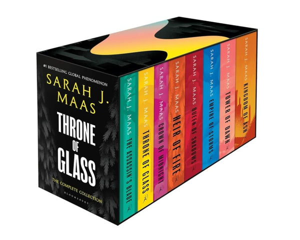
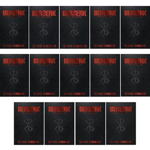
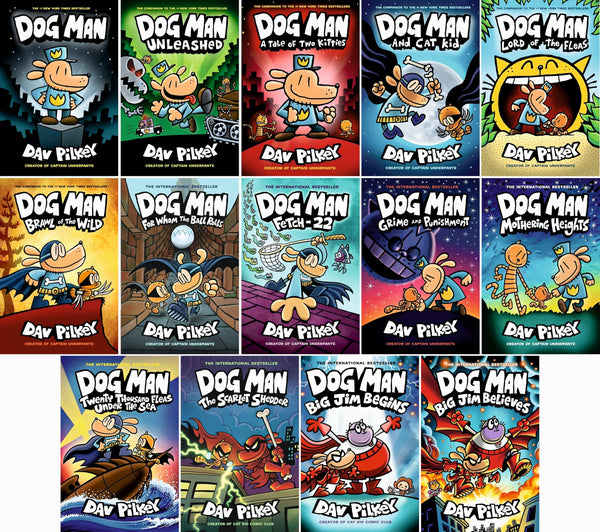
Reader-loved collections
Find your next world.
Five favorite shelves. So many places to begin.



Shipping
In-stock orders ship in 1–2 business days.
Click Here for more info.

30 Day Returns
Enjoy Hassle-Free 30 day Returns & Exchanges

Top-notch support
Email us for help with an order.
info@thelimitlesschapters.com

Secure payments
All payments are secured using latest SSL Encryption.